Wednesday, September 26, 2012

Le Freak

Singing again?

How about  NOW?

Our group ATC topic for August (how fast is this year going?!) was Carnival.

If you have read through this blog, or know me AT ALL you will be aware of the passion I have for all things  Brazilian. Country, people, language, food, drink... and Carnival is something, I am sure most people are aware, that they are ESPECIALLY good at! But when we use the words 'carnival' and 'Brazil' in close proximity most people are inclined to think of the Sambadrome, where the Samba Schools parade down the middle of a long arena with huge bleachers on either side. If you are exceptionally good looking, which I have to say, most Brazilian in fact ARE, you generally wear very little. Actually, you don't have to be all that good looking! So long as you are having a good time! But it would be fair to say most people would imagine something like this:


I found the movie 'Rio' was actually pretty good in reflecting some of the character of Rio during carnival. Especially if you are looking for something age appropriate! It is also just a lot of fun! Tangent! (We've been studying the Olympics in our homeschool, we'd all like to go to the 2016 games here!)


However, I spent Carnival in Salvador. Ah, Bahia....... Que saudades...... Where was I? Oh yes, Salvador. And they have the street parties, but not in the perfectly choreographed and costumed. To give you some idea Carnival in the North East started something like this:

Trio Electrico 
 A 'Trio Electrico' - a band, on a car with some speakers... good start to a street party, no?
Over the years the car grew. Add many, many more speakers, and more musicians on top...

Trio Electrical, Salvador ca 2005
To complete your Bloco, add: lights, sound, people... and you get something like THIS:

Chiclete com Banana!
It is less refined than Rio, but audience participation is obligatory! Try not dancing in this environment, it is inescapably contagious. This is were I learned to samba. Needless to say my samba is more 'freestyle' than 'classical'... :)


I asked my Brazilian friends what Carnival makes them think of.... here is a broad selection of answers:

Fun, passion, imagination, 
indefinable emotion, music, 
HUGE party, people,
dancing - everyone together/togetherness, 
contagious joy, beer, Trio Electrico,
 happiness....

Essentially, that is exactly what I thought of when I was trying to conjure up what Carnival in Salvador had meant to me. It was AMAZING and INDESCRIBABLE. Or at the very least, absolutely IMPOSSIBLE to capture on a 2.5" x 3.5" card!!

That is a long, but educational (well, I enjoyed it!) way of say that I had to go back to the drawing board...

You've had to long story, so here is the short. I thought Carnival side shows would be fun. I deliberately  skipped over some of the more 'interesting' (read 'gross'!) photos available; think elephant man, limbs growing where they shouldn't - there are some REALLY um, out - there photos to be googled. But I decided if it made my skin crawl just a little bit, it wasn't really fitting my scope for the more 'fun' aspect to Carnival and wasn't going to make the cut. *shiver* To play it reasonably safe, I stuck to Bearded and Tattooed Ladies and the like. You'll see :)

I wanted to incorporate that "peep show" idea, where they are veiled, or in a tent/behind a curtain and it is drawn back to reveal the HORROR - Be Shocked! kind of feel. So I decided to make the cards into a matchbox kind of fold. So I doubled the length and added a little flap to try and keep it closed. Which only works if you don't put too much inside. Like I never would.... I ran some black Bazzill through the Cuttlebug with a Tim Holtz Subway embossing folder that reminded me of carnivals, which I inked roughly and stapled some tickets to. Once more I find myself having to apologise for the photos. I always seem to leave it until the moment I am about to walk out the door to give them away before I remember that I haven't taken them and it is a bit of a rush. One day.....


Inside I used a doily die, glitter and nail varnish (usually on hand around here), organza and gold cord and various card stock and pens. Initially I intended for them to look as if there were on some sort of stage, but in the end I just doodled and assembled. I love art rules! 

Tattooed Lady

Contortionist - always freaky

Tattooed Lady - She would have scared me!

Technically not a Side Show Artist. Evidently she is one of the first Burlesque dancers. I loved the way it looked like she loves her job.... you'd better enjoy her show, or else!

Bearded Lady

Another Tattooed Lady - I just loved the images. What a facial expression; I wonder what she was like as a person....

Not sure what their act was, but it is a fun picture!

As far as Siamese Twins go, these two were practically normal compared to some of them!

I thought she looked nice and friendly. Put her in a high neck shirt and pants and you'd never know...


Sunday, August 5, 2012

Putting Yourself Out There...

Ok, so I publish this blog, and I make things for friends. But I have never really, really put myself 'out there'. You know, opened myself up for any sort of criticism, judgement, or worse: rejection! Well, when an occasion presented itself to enter an artwork for a competition that seemed relatively safe (ie: I knew some of the people and they were nice - read 'gentle'!), one had to suck it up and give it a go.

Deciding to enter was the easiest part!

The scope of the competition was: any media/mixed media (including poetry etc, but you can see how amazing I am with words.... not a strength!) portraying a 'Joan of Arc' inspired theme, particularly women and spiritual strength. (I am paraphrasing excessively here; but this was the gist of my interpretation of the scope!) I love all the ideas of women fighting and being strong (my name means Female Warrior, would you believe!), but for me at the moment - because we are always on a changing journey as we grow; there are a couple of verses that are mine, for this season in my life.

The first is Isaiah 30:15

In repentance and rest is your salvation, in quietness and trust is your strength.

And the second, Micah 6:8

And what does the LORD require of you? To act justly and to love mercy and to walk humbly with your God.

There have been times in my life, and will be again, when I am 'fired up' and in more of a 'fighting' kind of mood. Right now, I LOVE resting in the Lord. I could tell you how amazing He is to me, but that would take forever. But it is in Him I find my identity, so to try and interpret a scope (especially a spiritual scope!) apart from where I find myself spiritually, doesn't lead me to inspiration. And who wants to paint when they are not inspired? Not that I am saying this is an especially inspired work! It is not a theme I would have chosen myself and that is good, because it forces me to be more creative, allows me an opportunity to detach myself a little - not be so emotionally attached, relax, and give it a go! So I did....!

The verse I could not get out of my head was Psalm 91:11; For He will give His angels charge concerning you, to guard you in all your ways. Essentially, He has our backs. No matter how tired I am, He lifts me up and fights for and with me. That is awesome.

Anyway, onto the actual painting bit!

I'll show you the finished product first. I had an opportunity to name my work - Whaaaaa?? Only 'real' artists do that?!?! I went with 'Untitled', as it happens, as I had NO IDEA what to call it! (I have a great pic for that- see at the bottom!) And though I am acting all brave sprouting in front of the computer, I really hope you like it!


The idea was that the angel is protecting the girl - I used a young woman/girl because a) Joan of Arc was a young woman, and b) the idea of youth has a vulnerability to it. I wanted it to be an interpretation of a stained glass window, full of vibrant colour. I love colour.... I used so many mediums because I wanted it to shine, giving the impression of a heavenly vision, and clean armour that doesn't get damaged in battle (Is 54:17).


I used my husband and daughter as size models! Then drew up a grid on hardboard that had been gessoed.


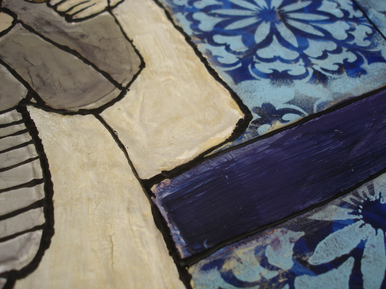
I missed a few stages... I layered tissue paper over the angel to get some texture and shape. It was really discouraging for a long while because it looked like the angel was going to take the main focus, when I had hoped it would be more in the background. For the blue 'sky' I used a textured paint and a stencil that reminded me of a medieval church. (Borrowed off my lovely cousin xxx). The gold lines on the main figure were to stand out later when I added a metallic tape on top, to give the armour it's shine.... The 'hills' are layered papers, distress inked with a bubble wrap texture, dry brushing and probably something else I have forgotten!


Once I got the tape on the armour I could add some alcohol ink and her hair. It was really hard trying to figure out how to get some light into her hair - what does hair in glass look like?? Then my darling MOTH helped me make a stencil for the banner and text (the milky look above is because I had just added -another- layer of gel medium....). The banner (Songs 2:4 <3) is made with texture paste and tints and is glazed to look like an aged scroll. Whether I achieved that or not I don't mind, because I loved the texture. I could run my hands over this painting for ages! And to me, that is what makes a painting enjoyable. The text, I printed and patiently cut into a stencil.... yes, it was a laborious and painstaking thing to do. But I think it was worth it!  I FINALLY applied the 'lead lighting' lines. They were the last stage that bought the picture together. I am not happy with them! But what could I do by then!??! I used an applicator bottle, and as it warmed it came out unevenly, and in some places there was an air bubble! Grrr! But imperfections - well, just has to add to it, huh? I had to get over that and just hand it in regardless! Over a month of work for nothing? I don't think so!


Two photos to show the light differences and the ink tones on the armour.


Glazes, gel mediums, perfect pearls; don't all show up in photos.


Love glaze!


Love cracks!


Love layers!


More cracks! I think I went through a fair bit of crackle mediums of varying kinds.....!


Lots of gold mediums here, hard to see in the photo.


CRACKS! :)


And just a couple (more) photos in different lights/with/without flash to show the tints etc. Really so much better in 'real life'!.


Love GOLD!


So, am I happy? Meh..... yes and no. Mainly yes. I am so stoked I actually DID it. I don't expect to get a placing - that wasn't the motivation. One good thing though is that I have opted to have it sold via auction at the end of the competition (I couldn't put a reserve on it, not ready for that yet!! Besides when I look at 'The Formula' below, who can afford me!!?!), which means I can tick of a bucket list item: sell a painting!


The Outlook for Thursday

Weather


It has rained here everyday for the past fortnight. I am more than over it. the ground is so sodden that even in the breaks you can't send the kids out for a play. Feeling sorry for myself? You betcha! But that is pretty normal for New Zealand. I am pretty sure when Crowded House wrote 'Four Seasons In One Day' they were thinking about Auckland, whatever else they may have been trying to convey!


Summer sunshine - my FAVOURITE weather, just seems so far away. And songs about sunshine are just a bit difficult for me to be inspired by when the rain is pouring down my window. It is just cruel. 


I had decided to just the KISS principle this month (you know, Keep It Simple, Stupid!) so I raided my supplies again... and found the perfect answer. I am sure many people will recognise the Tim Holtz stamp I have used! But to pull it all together.... 


A classic 80's (famous in NZ!) song, that always makes me feel sunny on the inside! And it has our weather pattern picked! 


DD Smash
The Outlook For Thursday


I started with Bazzill cardstock which I painted with Tim Holtz distress crackle paint; then made a cloud shaped template with which I made the clouds, inking over the top in a blue shade. Then I made a quick isobar sketch over that, added the stamp and a rock candy glaze. I managed to stick to my KISS intentions - how about that! No idea how I am going to manage next months challenge.... but I will leave that to the last minute.... I would like to say just kidding, but I have a funny feeling....


Monday, June 11, 2012

Kitschy Kitchen

And so began our Retro Cookarty Weekend....

My immaculate workstation!  
Just in case you thought I had the whole table, five of us managed to make paster pieces (incomplete; a work in progress!) at this one table! This photo only shows half of the women who came!


I have (of course) still to finish my altered book, and I will post some photos soon; but first of all, I am posting the recipe swap and my ATC cards.

What an awesome weekend! So good for the soul, *sigh*. I feel like I am jet-lagged or something though, like I have 48hrs or something that I can barely account for.... it went so fast it feels like a bit of a blur! I am all dazed and confused, but gleefully craft-drunk; new term I just made up, I think... feel free to use it ;) Actually, I did feel a little hung over on Saturday for no good reason other than needing some more sleep and a good coffee. I got the coffee :)

I was not the only one to pick a red and white themed card. I don't know why but it was an immovable decision for me. I don't have a red kitchen, btw. And if I was going to have a retro kitchen (bring it on!) I would choose a pastel teal/lemon sort of combo. I think. But my tastes are many and varied, and if I ever settle on the 'perfect' kitchen, I will probably die of surprise (at my usually non-existent decision making prowess) and then it will be of no use to me.... Any-whoo... I found this dinky little advertisement of a Mother and Daughter wearing aprons, the selling point reading 'for thrifty Moms and Daughters too'. As it happens, my daughter and I do seem to have matching aprons. Completely by fluke, but there you have it. It looks cute on her, not so much on me but that is another story.

So, picture and colour theme in hand and mind, I raided the art supplies. I used acrylic paint, inks, copic  markers, crackle, florist wrap, cupcake papers, paper doily, wool and thread, jump rings and shrink plastic. After getting them all to shape and size etc, I sewed them all together with my little beast of a machine. (You think I'm kidding. Well, maybe more of a mouse than a beast, but it would like to be a beast if it ever grows up - which I doubt, and so is practising....)

And here are the results. :)

Stamp - original size next to jump rings for comparison


Detail of cutlery


And to finish, something sweet.... I made my grandmother's Harmony Tarts for the weekend's er, sustenance, and swapped the recipe. And it was delicious..... I saw more than one worn out artist go back for more than seconds, and I have to say that it was deeply gratifying! I am only sorry I forgot to take a photo of them first! But here is the recipe.


Grandma’s Harmony Tarts

1 roll puff flaky pastry
2 egg whites (3 if small)
½C sugar per egg
¼C coconut per egg
Lemon essence
Raspberry jam

Beat egg whites until stiff. Gradually add sugar, then fold in coconut and lemon essence. Cut pastry to fit greased muffin tins and prick. Add a small teaspoon of jam to each and spoon meringue over. Cook in hot (200C) oven and watch. If meringue burns, turn oven down. Remove when pastry cooked. Run knife around pastry and cool in tray.